Feelin′ Blue – Pick a Color
Feelin′ Blue – Pick a Color
by Russ Burden
Color can be a very powerful graphic element in a photograph. Red, orange and yellow tones evoke a feeling of warmth while blue, green, and purple are cool and refreshing. Warm tones are often more striking and seem to pop off the page while cool ones recede and are more subdued. Color can be responsible for the mood of a photograph so depending on what you want to portray, the proper choice of color is important. The more pronounced a specific color is, the more it will impact the feel of the image. Too much color can overwhelm the viewer. It’s better to isolate a certain color or just have a single colored element in the composition to draw the viewer’s attention. This is what brings me to the premise of this article – the color challenge.
Challenge yourself wherein you pick a color and concentrate on it for a day, week, month, or simply make it an ongoing theme. Every time you pick up a camera, look for subjects that portray the color. But go beyond basic capture just taking a picture with color. Make sure you stick to all the photographic concepts of good photography. Lighting, composition, depth of field, shutter speed, etc. all need to be addressed to make viewers want to study the finished theme of pictures. Simply having pictures with, for instance, red items, doesn′t mean you’ve accomplished what you set out to do.

Depending on the color you choose, lighting will have a big impact on the success of the photographs. Early and late sunlight enhance warm tones and give them a very saturated look. It also tends to remove some of the coldness of blues and greens. This may be the effect you desire. Experiment and shoot in all different kinds of light. Something unexpected may surprise you in a good way. Don’t overlook different sources of artificial light. Direct flash gives a hard look while a diffuser placed in front of one softens its light and wraps around what you photograph reducing the contrast. Tungsten light used with daylight film gives an orange cast. Tungsten film shot outdoors gives a blue cast. If you’re shooting digitally, play with the white balance settings in the camera or shoot in RAW and experiment with the white balance in camera raw.

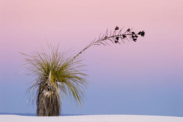
With regards to composition, be cognizant of how colors play against each other. Are they too close, too far away, touch an edge and bleed off the image, too much, or too little? As you compose the image, study the entire viewfinder to make sure the above pieces fit into place. In the accompanying images I played around with the color blue. No set reason as to why I chose this color. You may pick a tone as it’s your favorite or simply pick one out of a hat. It may be a great idea for your camera club to do something like this as a theme for a monthly competition.

To learn more about this topic, join me on one of my Photographic Nature Tours. Visit www.russburdenphotography.com and click on the NATURE TOURS button for more information. Also, pick up a copy of my new book, Amphoto’s Complete Book of Photography. You can purchase a signed copy directly from me or visit your local book store or Amazon. Contact me at rburden@ecentral.com to order your signed copy.

