DPA Magazine
Mark Rosengarten Offers Beautiful Images Accompanied by Excellent Photo Tips and Technical Insights

Mark Rosengarten Offers Beautiful Images Accompanied by Excellent Photo Tips and Technical Insights As the sun set, a long exposure from the dock while standing in the water: From the Gomez Mill, a 1/2 second exposure to show more detail in the spray: We did get about ten minutes of insane color on the horizon about 20 minutes after sunset: The Gomez Mill: A 2-minute exposure to smooth out the water and sky, done in Bulb mode: Using snow as the leading line into the sunset: Funneled along the inlet: It was wonderful meeting you all and I hope you all got a lot out of it! Hope to see you again and looking forward to seeing your work here!! Mark Rosengarten
Pro Shooter Ken Ross Critiques Student Cindy Spicer’s Images
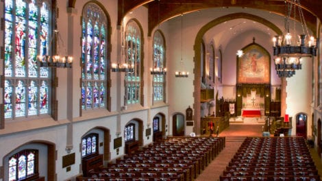
Pro Shooter Ken Ross Critiques Cindy Spicer's Images Hi Cindy, I wanted to take some time to go over your images and give you as much specific feedback as I could – drives me crazy when all I get from a critique is “nice” or “I like that” – doesn’t help me get better and I try not to do the same thing to my students I’ll also include an example adjustment of your original image, just to illustrate my comments – it’s art so remember that my comments are just my own perspective and opinions; you have your own story to tell in your own way! I love the angle of this shot for expressing the grandeur of the sanctuary – it really helps “set the table” for this set of images and gives the viewer a sense of perspective when their viewing the other images. There are two things that I’d want to do in order to improve this a little more; correct the perspective skew and the white balance. The skew is a natural side effect of lens distortion of course but when you’re shooting architectural subjects, it’s really important to make sure the walls at straight. Fortunately, Adobe Lightroom has a feature that makes this sort of thing super easy to fix! Also, knowing that you’ll have this sort of correction to do with architectural images, be sure to always shoot “wider” than you really want for your composition; straightening out the walls will result in cropping off some detail on the edges (the top left & right in particular for this image). For the color balance, you’ll find scenes like this are very difficult for the “auto” white balance to deal with; there are a lot of different light sources in the scene and lots of colored light too. The camera does the best it can but just doesn’t have a good reference. There are a number of ways to you can solve for this; the easiest is to make note of a white or “neutral gray” area in the scene that you can use for a point of reference; as long as you are shooting in RAW, you can use the White Balance Selector Tool in Lightroom to select that white/gray area and it will adjust all the colors in the image to correct them. If you’re in a place where you don’t see a good candidate (and it can be something like a white plastic bag, a gray sidewalk, etc.), just drop a blank white sheet of paper in the scene where it’s being hit with “representative light” and use that as your reference; you can take a second shot without the paper there and, again in Lightroom, you can copy the white balance adjustment from your paper reference to your other image (select both images while in the Develop tab, click the Sync button and select just the White Balance adjustment to copy). Since the samples you sent me were JPG files I couldn’t do a true White Balance correction (you need RAW for that) but Lightroom tries really hard to re-tint a JPG to get close so it’s representative of what you could do with your original image (but you can definitely do a better job!). Likewise, Lightroom does a better job of correcting lens distortion if it knows the make and model of the camera and lens used; it can usually read that from the original image meta data but that’s often stripped from JPGs (and for some cameras you may need to download additional profiles if it doesn’t know them automatically). Love the high angle of this shot – it’s more dynamic than the first image and less of a literal expression of what the sanctuary looks like, but is more exciting due to the perspective. Here again we have some alignment/skew correction to do as well as white balance (although the camera is doing a better job this time). Other small adjustments include increasing the exposure, contrast and a bit of Clarity (helps pop textures in these sorts of setting but be careful of using it with people in the scene as it can make their skin look haggard). I remember working with you on this composition and am really pleased with how well it turned out – I think the angles work well and framing the pipes between the stain glass windows gives it a strong sense of place. I made a few adjustments here to boost contrast and add a bit of Clarity, but didn’t want to brighten the image too much more and lose the mood (or blow out the windows). I did feel like the pipes needed to be enhanced though because they’re a key element in your story; I used the Adjustment Brush in Lightroom to just “pain on” more exposure for the areas of the pipes I wanted to emphasize and used the pipes themselves as a White Balance adjustment reference (they’re gray). Really love how this turned out – I told you you’d get it!! This is exactly what we talked about with this technique; get enough exposure at one spot to cement the details (especially her face) and then pull back on the zoom to create that dynamic effect in-camera. Great job!! My only contribution here is to boost contrast and add Clarity to help the image pop and create more apparent sharpness on the base image (see how her face looks “sharper”? That’s due to Clarity). This is another outstanding image. I really love how you saw this possibility while we were walking out and insisted on “working the scene” to make this happen. In particular, I liked how deliberate you were in your framing and, as a big fan of high-contrast B&W images myself, I love the mood of this image. Here again I’ve made just a few small changes to take an already great image up a notch; exposure has been increased slightly to get more detail on the foreground element, I’ve rotated the image slightly to straighten the window and added Clarity to bring out the texture in the floor. Lastly, I used the Lightroom Adjustment Brush to paint in some “drama” on the top three window panes, adding a bit of exposure and Clarity while making the dark areas just a wee bit darker. I’m going to be honest here; this isn’t a great composition. The exposure is good and the white balance is reasonably good, but in terms of presenting a subject or telling a story I feel this fails to hit the mark. I know that you were drawn to that amazing keyboard, a subject that excited you and was frankly challenging to capture (you knew what all the buttons did but it might as well have been the space shuttle cockpit for me!). Looking at this image as presented, it appears that the subject is the decorative carving at the end of the pew (rather than the keyboard) but the keyboard in the background is too distracting (and the top of the carving is just being clipped by the top of the frame). Lastly, the railing at the edge of the pew is acting like a “leading line” – pulling the viewer out of the image instead of into it. Now, there are a number of things we might do differently if we had it to do over again (hindsight is awesome) but what we can do to improve the image we have at hand? Well, let’s assume the subject is the carving. Let’s take advantage of that leading line like we talked about in class – use that to help direct the viewer to our subject. How? We’ll flip the image so that line is coming in on the left . Next, we need to create more emphasis on our subject than the background; we can do that by using the Adjustment Brush in Lightroom to paint the areas we want to de-emphasize, making it darker (less exposure) and less distinct (lower the Sharpness and Clarity). Then, create a new brush and paint a little added exposure and Clarity on the details on the face of the carving. Lastly, we crop the image in a bit tighter on the main carving and use the Post-Crop Vignetting to darken the edges of the image, further deemphasizing the windows and back wall. There’s a lot to like in this image – the atmosphere of the solitary “parishioner”, the dramatic lighting from the windows. However, when we have a person in the image then the story really is about them and I feel like the image is too dark with too many bright windows and our subject just gets lost. What I’d recommend in this case is to re-crop the image to make it more about the subject and then use the Adjustment Brush to paint on just a bit of extra exposure on our subject’s face and arms, just enough to lift them out of the shadows but not so much as to make them look “flashed” or unnaturally lit. I didn’t want to do anything to the overall exposure since that would change the mood too much. Another great angle to explore in this venue – really love how you’ve picked up the play of light across the floor and controlled the exposure so that the massive stained glass at the back of the sanctuary wasn’t blown out. With this image we have very little to correct that we haven’t looked at earlier – some White Balance and perspective skew adjustment is all we need, as well as a smidge of Contrast to make it pop. I hope you found these comments and examples helpful and thanks again for coming to my class and for sharing your images with us! Ken mailto:ken@kennethrossphotography.com http://www.kennethrossphotography.com/
How the “Aperture Priority” camera setting can transform “snapshots” into compelling images that tell a story.

The aperture setting controls the “depth of field,” i.e., how much of the photo will be in focus, and how much will be blurred.
REMEMBER–PIXELS ARE FREE

REMEMBER--PIXELS ARE FREE Rebecca Bozarth attended a session led by DPA Instructor, Ken Ross, at the Atlanta Botanical Gardens and beautifully exemplified the old Photo Adage, that "Pixels Are Free" so take as many images as you can, from every angle because you may not have another chance!! In fact, as we should have guessed, Rebecca is not the typical Digital Photo Academy student. She is a professional photographer in Atlanta, Georgia, who owns her own design company, Fotografia Film & Design www.fotografiafilmanddesign.com. She is a SCAD Atlanta graduate, and specializes in photography, videography, graphic, and web design. Great opening image with colorful floating orbs in the foreground to anchor the eye of the viewer and lead first to the Chihuly glass structure with adequate attention to the waterfall and of course the magnificent plant lady. The entire scene is upon us without too much focus on a detail or too far away so the impact of the scene is lost. Remember, either with your lens or your body or both, get closer. In this case the image is still anchored by the floating orbs but not all 4 and there is greater emphasis on the chihuly AND waterfall. The plant lady is left in the shadows. Now after closer go further back. The plant lady is shown in the context of the broader setting and creates a different perspective of the way she dwarfs the Chihuly. Interesting perspective. The colorful flowers in the foreground, green leaves included add a brightness to the overall image and compliment the Chihuly. Now back even closer than before to isolate the Chihuly and its relationship to the waterfall, grey stone to accentuate the artwork, with drama added with a shutter speed priority to catch the water in midstream. Even closer to allow the viewer to make a comparison and closer still. This one would might be favored by Chihuli himself even though a portion of his work is cut off. Now an emphasis on the plant lady in a vertical, enabling the viewer to take greater note to the water from the lady's hand. Chihuly is nice but the image works without its presence too. Same notion but this time horizontally and the photographer has a choice as does the viewer of the photo. This time the colorful orbs are missing and it is a study in green, enhancing the focus on the lady's face and arm. Another vertical with some complimentary yellow in the hair and closer look at the face of the lady This Chihuly might even be a completely different display but why not add it in to show the Art Deco, opaque whimsy of the man's creation.
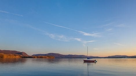
Rule of Thirds Approach of Composition As Well As The Camera Control of Aperture Priority

Rule of Thirds Approach of Composition As Well As The Camera Control of Aperture Priority Greg Miller, one of the Digital Photo Academy instructors in the Hudson Valley chose to create the illusion that the sail boat, which was actually about 150 feet from the shore, was much further away and created an ethereal peaceful scene using the Rule of Thirds approach of composition as well as the camera control of Aperture Priority. But remember to move around a lot because there is always another compelling image in every setting. For example, student William Wilmot bided his time and focused closer on the boat, snapping the shutter just as the sun quickly winked at it. Additionally, he framed his main subject with the leaves in the foreground.
Even In Poor Lighting Conditions, Always Try. Pixels Are Free As They Say!
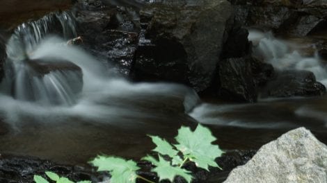
Even in poor lighting conditions, always try. Pixels are free as they say! With Landscape photographer, Greg Miller, Nana Greller was wandering beneath a thick canopy of trees amidst the soft light behind West Point Foundry, Preserve in Cold Springs, NY. It was a rainy Sunday, kind of low light that seemed to show no real promise, wondering of the possibilities for any photo worth keeping. Greg disagreed in regard to the potential and Nana came away with this lovely image, which is actually a fairly anemic waterfall, at least on that day, maybe not so piddly every day. The leaves frame the main subject nicely and the slow shutter speed priority renders a haunting version of the cascading water. Good job Nana.
Washigton, D.C. DPA Instructor Jim Tetro Shows Us Great Iphone Images Are Possible!
Washigton, D.C. DPA Instructor Jim Tetro Shows Us Great Iphone Images Are Possible!
Composition Tips On Michael Willems’ Images

Composition Tips On Michael Willems' Images FRAMING the earth toned mall with the bold and contrasting red street symbol on the left where your eye is first drawn, then sending you across the street. It is enjoyable to study this image and note the details of the parallel street sign across, just above the traffic cop, who is looking at the man in the black shirt, as is the b/w street sign of a direction arrow. Continuing the man in the black shirt is looking back and upward toward the brown building that then takes you in to the recesses of the scene and back via the white truck. The eye and brain of the viewer are having a great time here. Another FRAMING Shot, exemplified by the arched entryway into the hall. PATTERNS AND COLORS are always visually pleasant. Note the added dimension with the green grocery flags at the top of the image. Another trick to create appealing images of produce is to go close up and fill the entire frame with the fruit or vegetable, turning the contents into a colorful abstraction. LEADING LINES of the produce draws the viewer in to the interior of the scene. LEADING LINES in this shot are combined with an ASYMMETRICAL focus on the strawberries in the foreground. Great way to tell the viewer what they are looking at by FRAMING the building with the sign on the lower left. So many composition options inside a church with stained glass windows. In this case work with PATTERNS and LEADING LINES PANNING to create the effect of speed and motion With a SIMPLISTIC red background this street portrait helps one to view the individual in an empathic way, particularly with the same red in the jacket. The dark shadow under the vehicle is also a PARALLEL in shape and color to his legs in black pants. He is leaning on a post that anchors the eye of the viewer into the narrative taking place to the left. The bird is flying away, and out of the frame but your gaze is anchored by the structure at the bottom of the image. The visual between the bird and the wall at the bottom can be referred to as NEGATIVE SPACE, playing the role of keeping your eye movement within the frame. APERTURE CONTROL, where the photographer focuses the scene, blurs the background in a dramatic and visually pleasing manner to create a focus on the bust. There is also a RULE OF THIRDS at play, creating a more dynamic layout instead of an image with the bust dead center. Sometimes an image with the main subject in dead center is exactly that, DEAD. Depending on SHUTTER SPEED, moving water can be captured as a smooth flow or a split second of action.
The Morning Light
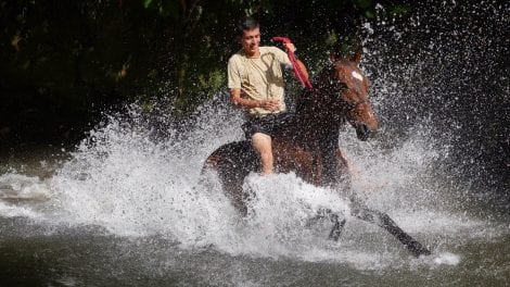
Rick Gerrity, DPA Instructor in NYC and NJ, adding a splash of drama of this man on a horse. The morning light brought it home. 1. Time-Morning Light 2. Place of photo – Costa Rica 3. Name of Photographer and which Digital Photo Academy teacher is in-Rick Gerrity Digital Photo Academy instructor in NYC/NJ 4. f/stop-f 5.6 5. Shutter Speed-1/1600th sec 6.Back story- This image was made while leading a workshop with my business partner DPA Instructor, in Atlanta, Rob Knight in Costa Rica concentrating on freezing motion. 7. Lens- 35-100mm on a Panasonic Lumix GH4 8. How one might succeed with a version of the image if all they had was a cell phone- With a cell phone one may follow subject while pressing the shutter button creating a blurred background. A cell phone may or may not freeze the motion. Panning will ensure a sharp subject. 9. Photographer’s Strategy- Teaching the importance of lighting, being patient and getting the shot.. Composition regarding the rule of thirds..
Tip on Photographing the Hudson River
That photo was taken during the Sunday workshop and Long Dock Park. It was just a grab shot since I rarely shoot during a workshop. 24mm on full frame Nikon D810 camera, 0.6 second exposure at F18. Shutter speed was important to render the water texture just right, so shutter speed of 0.6 seconds was chosen, then F18 was chosen to render a good exposure. Exposure was intentionally 1 stop less than the meter reading. The camera meter wants to render the scene a middle gray, but at this time of day, the scene is darker than middle gray. Using the exposure meter’s setting would have caused the photo to be too bright. Story 1: The chap who sails this boat swims to and from it from shore. Note that the water temperature on April is still quite chilly. Story 2: Most photographers go to Long Dock Park at low tide to shoot the pilings in the river that are visible at low tide. This beautiful view south towards the Hudson Highlands near high tide is rarely photographed.
