Pro Shooter Ken Ross Critiques Student Cindy Spicer’s Images
Pro Shooter Ken Ross Critiques Cindy Spicer’s Images
Hi Cindy, I wanted to take some time to go over your images and give you as much specific feedback as I could – drives me crazy when all I get from a critique is “nice” or “I like that” – doesn’t help me get better and I try not to do the same thing to my students I’ll also include an example adjustment of your original image, just to illustrate my comments – it’s art so remember that my comments are just my own perspective and opinions; you have your own story to tell in your own way!
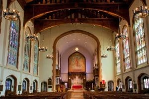
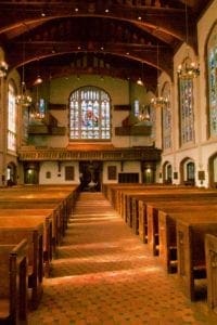
I love the angle of this shot for expressing the grandeur of the sanctuary – it really helps “set the table” for this set of images and gives the viewer a sense of perspective when their viewing the other images. There are two things that I’d want to do in order to improve this a little more; correct the perspective skew and the white balance. The skew is a natural side effect of lens distortion of course but when you’re shooting architectural subjects, it’s really important to make sure the walls at straight. Fortunately, Adobe Lightroom has a feature that makes this sort of thing super easy to fix! Also, knowing that you’ll have this sort of correction to do with architectural images, be sure to always shoot “wider” than you really want for your composition; straightening out the walls will result in cropping off some detail on the edges (the top left & right in particular for this image). For the color balance, you’ll find scenes like this are very difficult for the “auto” white balance to deal with; there are a lot of different light sources in the scene and lots of colored light too. The camera does the best it can but just doesn’t have a good reference. There are a number of ways to you can solve for this; the easiest is to make note of a white or “neutral gray” area in the scene that you can use for a point of reference; as long as you are shooting in RAW, you can use the White Balance Selector Tool in Lightroom to select that white/gray area and it will adjust all the colors in the image to correct them. If you’re in a place where you don’t see a good candidate (and it can be something like a white plastic bag, a gray sidewalk, etc.), just drop a blank white sheet of paper in the scene where it’s being hit with “representative light” and use that as your reference; you can take a second shot without the paper there and, again in Lightroom, you can copy the white balance adjustment from your paper reference to your other image (select both images while in the Develop tab, click the Sync button and select just the White Balance adjustment to copy). Since the samples you sent me were JPG files I couldn’t do a true White Balance correction (you need RAW for that) but Lightroom tries really hard to re-tint a JPG to get close so it’s representative of what you could do with your original image (but you can definitely do a better job!). Likewise, Lightroom does a better job of correcting lens distortion if it knows the make and model of the camera and lens used; it can usually read that from the original image meta data but that’s often stripped from JPGs (and for some cameras you may need to download additional profiles if it doesn’t know them automatically).
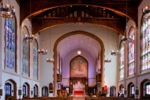
Love the high angle of this shot – it’s more dynamic than the first image and less of a literal expression of what the sanctuary looks like, but is more exciting due to the perspective. Here again we have some alignment/skew correction to do as well as white balance (although the camera is doing a better job this time). Other small adjustments include increasing the exposure, contrast and a bit of Clarity (helps pop textures in these sorts of setting but be careful of using it with people in the scene as it can make their skin look haggard).
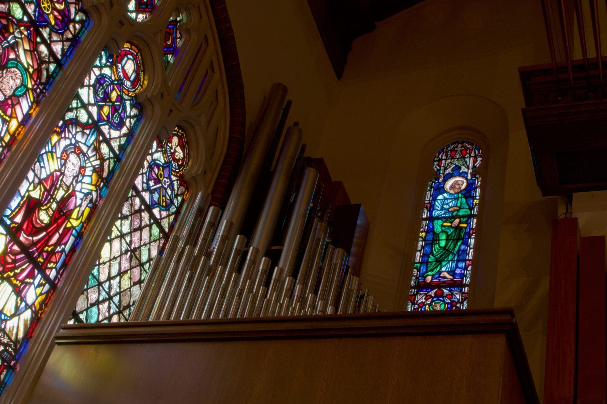
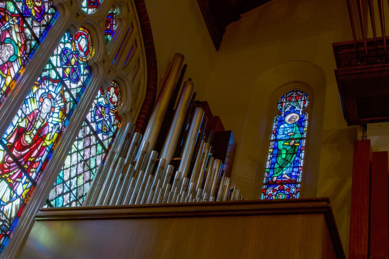
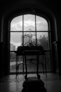
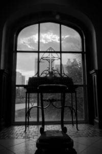
I remember working with you on this composition and am really pleased with how well it turned out – I think the angles work well and framing the pipes between the stain glass windows gives it a strong sense of place. I made a few adjustments here to boost contrast and add a bit of Clarity, but didn’t want to brighten the image too much more and lose the mood (or blow out the windows). I did feel like the pipes needed to be enhanced though because they’re a key element in your story; I used the Adjustment Brush in Lightroom to just “pain on” more exposure for the areas of the pipes I wanted to emphasize and used the pipes themselves as a White Balance adjustment reference (they’re gray).
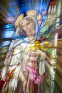
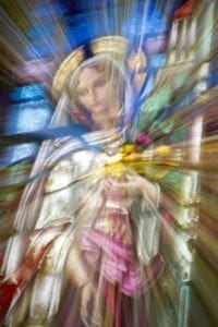
Really love how this turned out – I told you you’d get it!! This is exactly what we talked about with this technique; get enough exposure at one spot to cement the details (especially her face) and then pull back on the zoom to create that dynamic effect in-camera. Great job!! My only contribution here is to boost contrast and add Clarity to help the image pop and create more apparent sharpness on the base image (see how her face looks “sharper”? That’s due to Clarity).
This is another outstanding image. I really love how you saw this possibility while we were walking out and insisted on “working the scene” to make this happen. In particular, I liked how deliberate you were in your framing and, as a big fan of high-contrast B&W images myself, I love the mood of this image. Here again I’ve made just a few small changes to take an already great image up a notch; exposure has been increased slightly to get more detail on the foreground element, I’ve rotated the image slightly to straighten the window and added Clarity to bring out the texture in the floor. Lastly, I used the Lightroom Adjustment Brush to paint in some “drama” on the top three window panes, adding a bit of exposure and Clarity while making the dark areas just a wee bit darker.
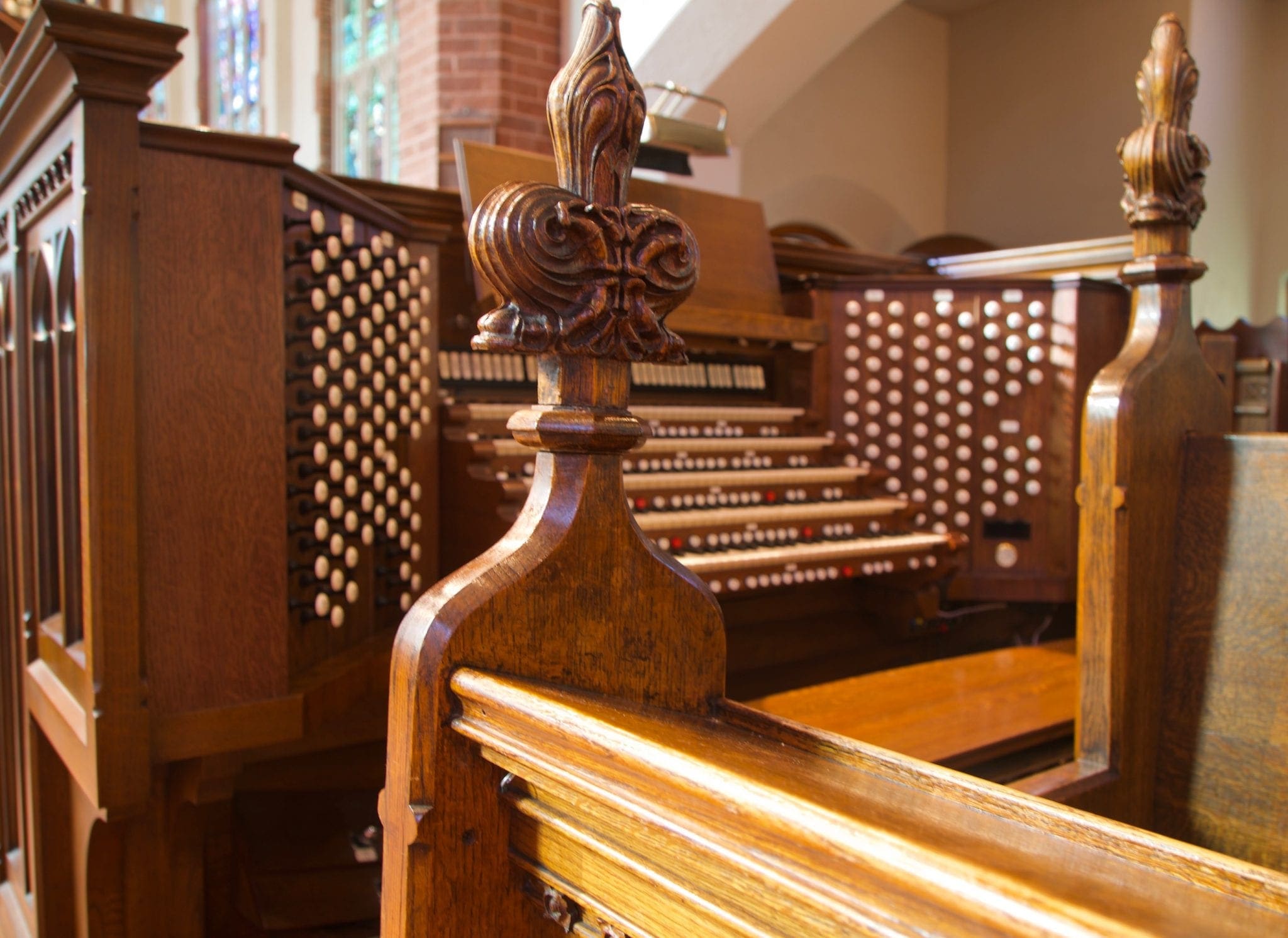
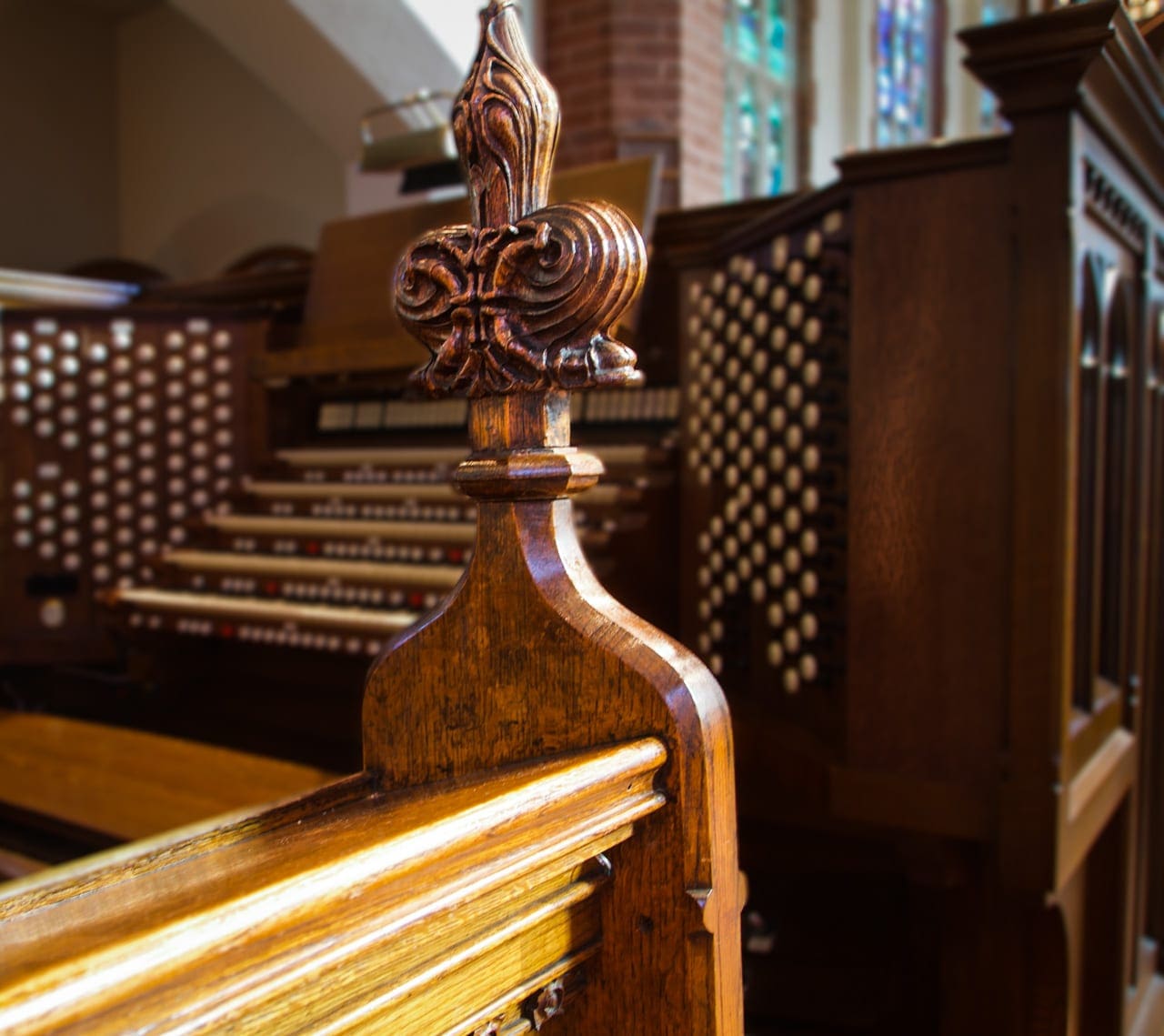
I’m going to be honest here; this isn’t a great composition. The exposure is good and the white balance is reasonably good, but in terms of presenting a subject or telling a story I feel this fails to hit the mark. I know that you were drawn to that amazing keyboard, a subject that excited you and was frankly challenging to capture (you knew what all the buttons did but it might as well have been the space shuttle cockpit for me!). Looking at this image as presented, it appears that the subject is the decorative carving at the end of the pew (rather than the keyboard) but the keyboard in the background is too distracting (and the top of the carving is just being clipped by the top of the frame). Lastly, the railing at the edge of the pew is acting like a “leading line” – pulling the viewer out of the image instead of into it. Now, there are a number of things we might do differently if we had it to do over again (hindsight is awesome) but what we can do to improve the image we have at hand? Well, let’s assume the subject is the carving. Let’s take advantage of that leading line like we talked about in class – use that to help direct the viewer to our subject. How? We’ll flip the image so that line is coming in on the left [we’re artists, not photojournalists – we can flip things!]. Next, we need to create more emphasis on our subject than the [distracting] background; we can do that by using the Adjustment Brush in Lightroom to paint the areas we want to de-emphasize, making it darker (less exposure) and less distinct (lower the Sharpness and Clarity). Then, create a new brush and paint a little added exposure and Clarity on the details on the face of the carving. Lastly, we crop the image in a bit tighter on the main carving and use the Post-Crop Vignetting to darken the edges of the image, further deemphasizing the windows and back wall.
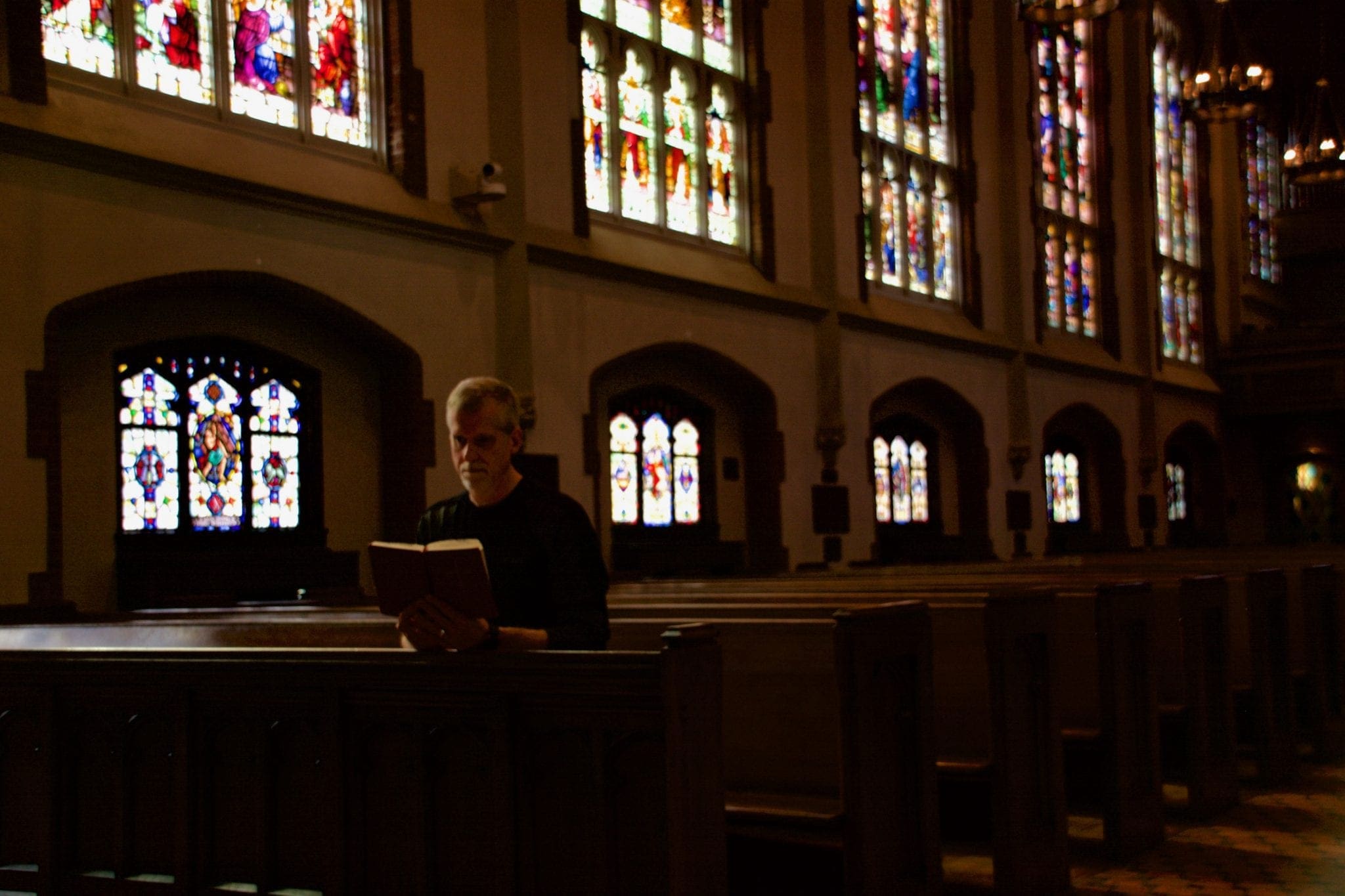
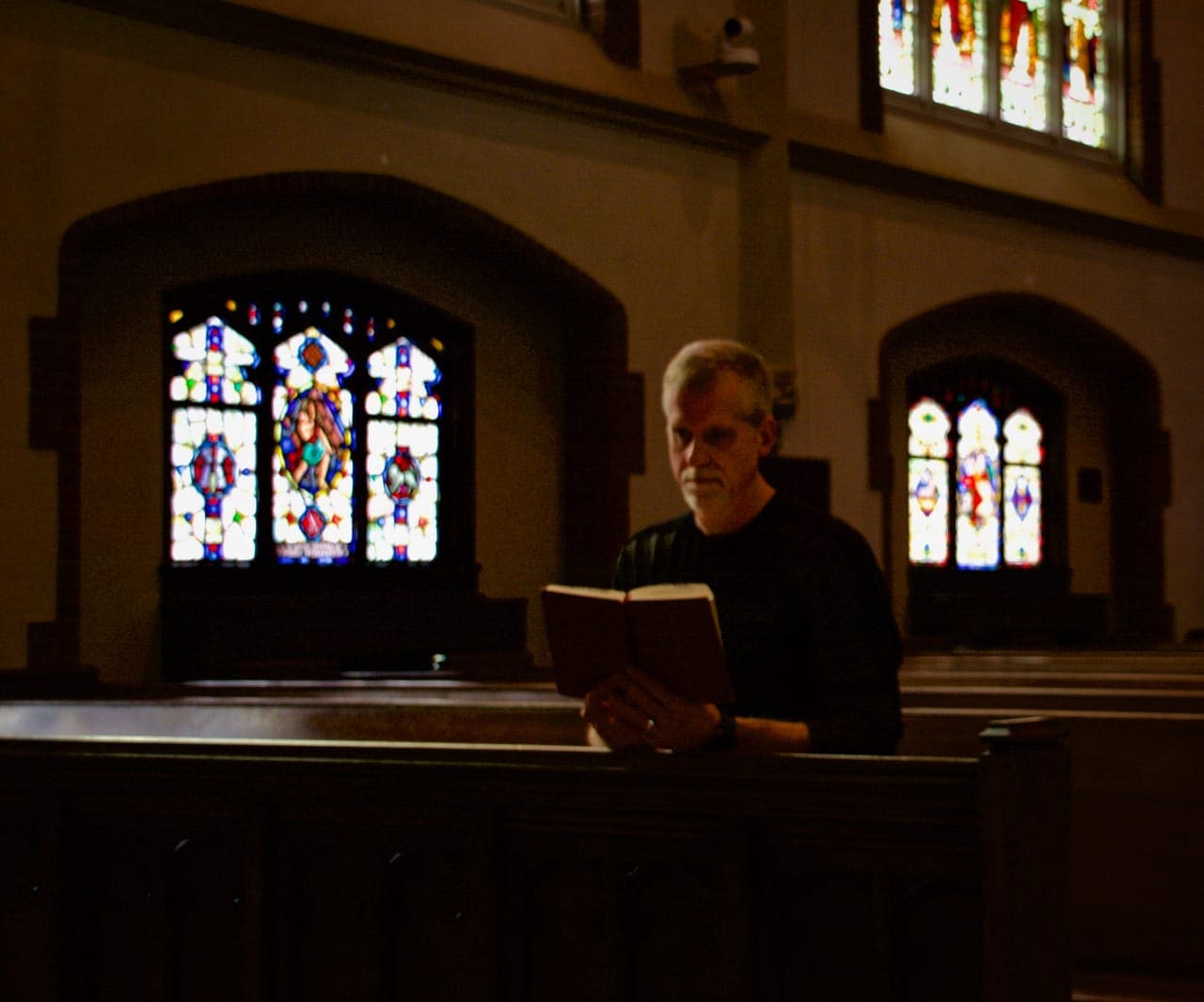
There’s a lot to like in this image – the atmosphere of the solitary “parishioner”, the dramatic lighting from the windows. However, when we have a person in the image then the story really is about them and I feel like the image is too dark with too many bright windows and our subject just gets lost. What I’d recommend in this case is to re-crop the image to make it more about the subject and then use the Adjustment Brush to paint on just a bit of extra exposure on our subject’s face and arms, just enough to lift them out of the shadows but not so much as to make them look “flashed” or unnaturally lit. I didn’t want to do anything to the overall exposure since that would change the mood too much.
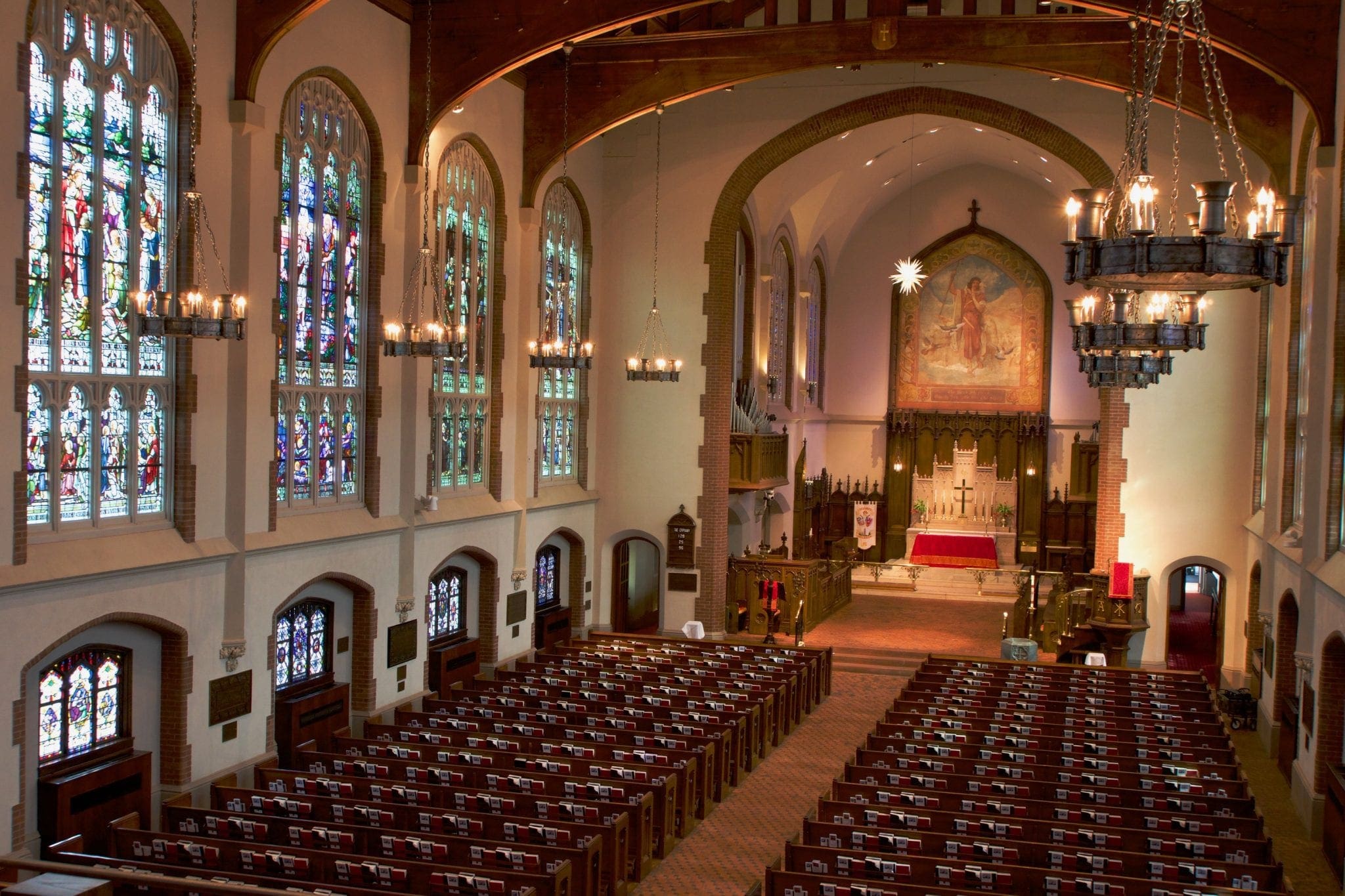
Another great angle to explore in this venue – really love how you’ve picked up the play of light across the floor and controlled the exposure so that the massive stained glass at the back of the sanctuary wasn’t blown out. With this image we have very little to correct that we haven’t looked at earlier – some White Balance and perspective skew adjustment is all we need, as well as a smidge of Contrast to make it pop.
I hope you found these comments and examples helpful and thanks again for coming to my class and for sharing your images with us!
Ken

