Eye Popping Color
The strategic use of color allows a photographer to create compelling images. Using eye popping color to draw a viewer into a photograph is one way to achieve this. It can be used as a design element, a way to grab attention, to show comparison and contrast, and even as a main subject. As a design element it’s wise to keep the composition clean and simple. Color can easily be used to grab a viewer’s attention especially when it’s bold and vibrant. When used to contrast or compare, it’s essential to be cognizant of the colors that are included. When used as a main subject, patterns, textures and abstracts come to mind. How you choose to incorporate all the above into an image dictates the outcome of the image.
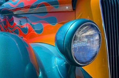
Scenes with contrasting color makes the viewer of a photo move back and forth from one object to the other. If the objects are connected, side by side, or right next to each other, each will compete for attention. Careful choice of what to include in the image is essential as it’s not wise to have opposing subjects compete for attention. Look for situations where one of the objects is much closer to the front of the frame as it will become the dominant element. Another good strategy is to look for elements that show a large variation in size. When a large, boldly colored object is compared to a small boldly colored object, the large one usually wins the battle for attention.

So how does a photographer achieve eye popping color? One way is to shoot at the times of day when color saturation can be maximized. The magic hours of sunrise and sunset allow this to occur. At these times, the warm colors caused by pollution, dust, and particulates that hover near the horizon create a golden hue that provides richness and warmth even in the colder tones of blue, green and purple. Avoid shooting in the middle of the day as the cool tones caused by strong blue skies robs color saturation. If you have to shoot during this time, try to get in the shade or work on overcast days. The reason color is more enhanced when it’s overcast is the glare that is cast on all objects on a sunny day subdues the color. Fall foliage is proof of the above. Try using a polarizer to minimize glare if you have to shoot in sunny conditions.

Photoshop CS3 and Elements include a wonderful tool called Hue/Saturation. I’m sure the majority of readers of this article are familiar with its use but for those of you who may not know of its existence, I encourage you to rush to your computer when you’re finished reading and play with it. Activate it by going to Image / Adjustments / Hue Saturation. A box appears with three sliders. The one you need to go to is Saturation. As you slide it to the right, the color saturation is quickly enhanced. I strongly urge you to use it conservatively unless you want to go through what myself, and many other photographers new to this tool went through. I had to redo most of the files I originally worked on in that I over increased the saturation because I could and, at the time, I thought it looked great. Be aware – just because you can doesn’t mean you should.

To learn more about this topic, join me on one of my Photographic Nature Tours. Visit www.russburdenphotography.com and click on the NATURE TOURS button for more information. Also, pick up a copy of my new book, Amphoto’s Complete Book of Photography. You can purchase a signed copy directly from me or visit your local book store or Amazon. Contact me at rburden@ecentral.com to order your signed copy.

